Why You Should Use Responsive Web Design
At the end of last year, Mashable deemed 2013 “The Year of Responsive Web Design.” Here’s an overview of the latest web design trend.
What is responsive web design?
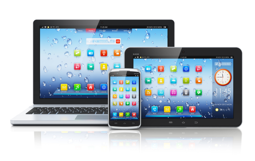
In the simplest terms, responsive design means that your site looks great on all devices. Whether your user is looking at the site on a desktop computer, laptop, tablet or smart phone, the design is set up to deliver the information in a friendly, easy-to-read format.
Technically speaking, this means that the content and information on your pages is all the same. There are just additional styles set up in the code to make the page display differently in the different situations. So you would still maintain everything in one place.
Why does responsive web design make sense?
More people are browsing the web in a variety of ways, as tablets and smart phones gain popularity and web access becomes ubiquitous.
According to Google, 90% of all media interactions are screen-based and 90% of people use multiple devices to accomplish their goals. Google even recommends webmasters follow the industry best practice of using responsive web design.

Likely your customers are viewing your site on a tablet or smart phone. In order for them to have a good experience, you must optimize for these formats or they will lose interest and look to your competitors instead. Let your customers easily interact with your information by making sure your site is “responsive.”
Can you give me an example of a responsive website?
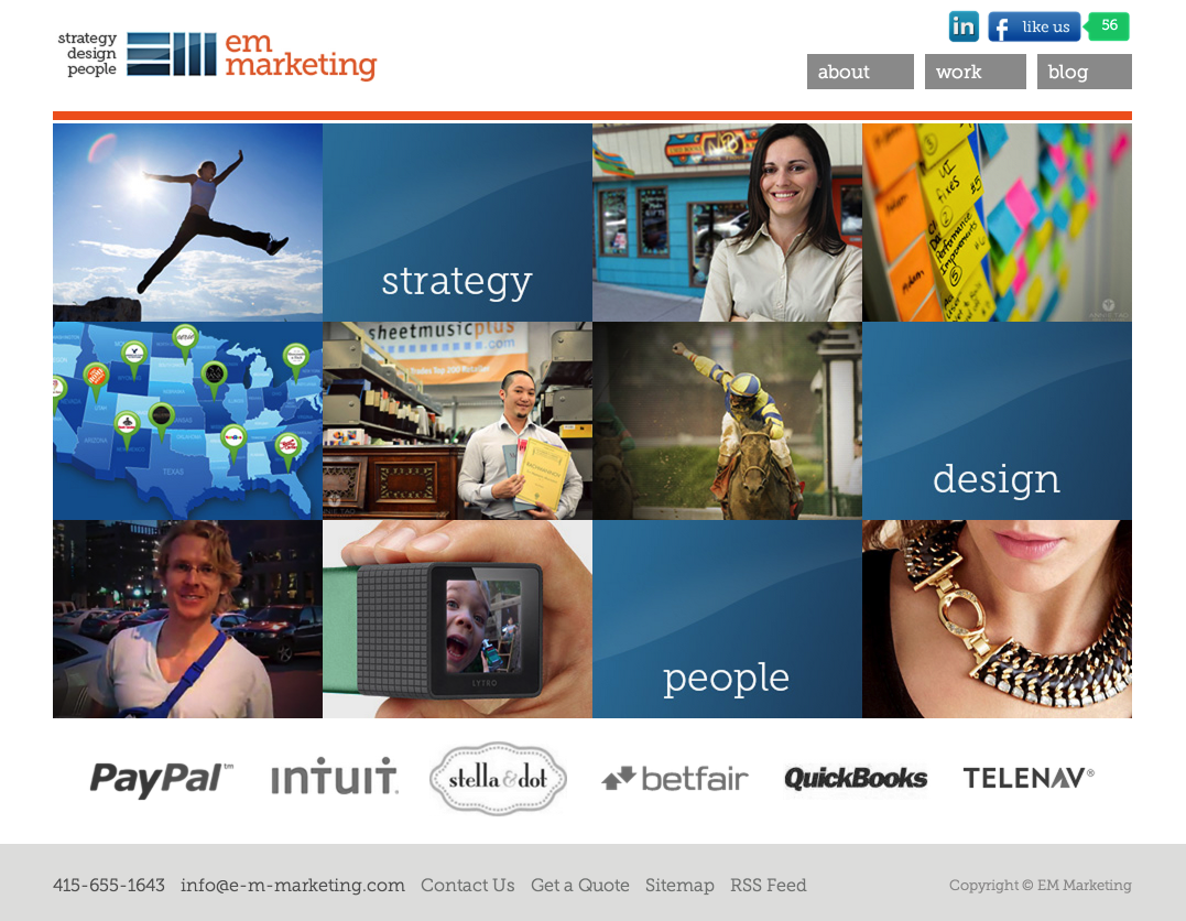
The EM Marketing website is a great example of a simple responsive solution. If you look at it on a computer, tablet or smart phone, the layout changes accordingly. It only took a couple extra hours of work and visitors can easily read our content wherever or however they choose.


Related
-

-
| Tricia McKinney
9 Project Management Best Practices for Creating Video Content
-
| Lynn Bruno
How to Make Video Content Production Sustainable
-
| Barrett Rudich
How to Bring More Value to Your Next Video Project
-
| Justin Liszanckie
Client Project: Website Redesign for Wurl
-
| Justin Liszanckie
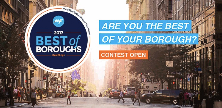
Client Project: Best of Boroughs Ad Campaign Design for Neustar
-
| Karl Pontau
5 Ways You Can Use Motion Graphics
-
-
| Justin Liszanckie
Client Project: Website Redesign for SnapStrat
-
| Karl Pontau
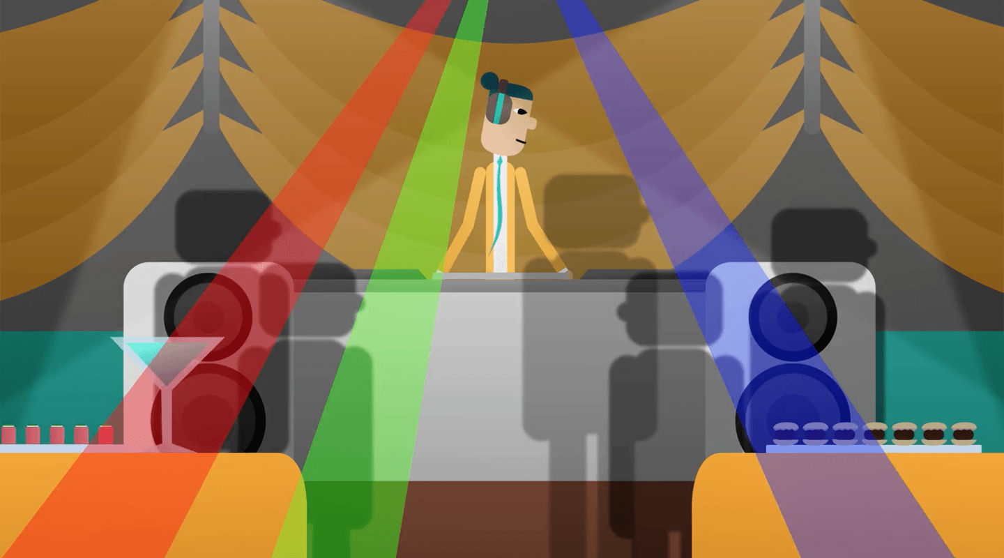
Inbound Marketing: How Motion Graphics Improves your ROI
-
| Justin Liszanckie
Client Project: Website Redesign for Precision Counts
-
| Justin Liszanckie
Client Project: Design Services for Intuit’s Firm of the Future
-
| Leilani Yau
Client Project: Illuminate Education Product Sheets
-
| Justin Liszanckie
Delightful Design Trends in 2017: Bold Minimalism
-
| Nicole Hanusek
Build Your Website in WordPress
-
| Ken Chen
What Makes a Landing Page Effective?
-
| Nicole Hanusek
The Best Websites: Functionality, Design, Usability


