
7 Ways to Optimize Your Copy for Mobile
It’s happening as you read this. There. It just happened.
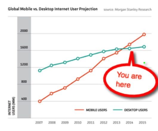
Mobile has surpassed desktop for Internet searches. And looks like there’s no going back…
Using phones, tablets, and now phablets, our time on the Internet is growing, while screen size is shrinking. The average display is between 4 and 5 inches.
What does that mean for copywriting? Here are 7 ways to rethink copywriting for mobile sites.
1. Write even shorter.
The mantra for great headlines has always been ‘shorter is better.’ But that’s when we were writing for 13” laptops back in 2012.
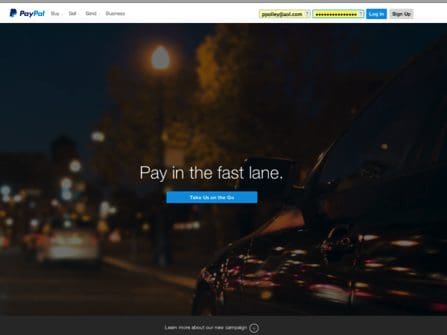
Look at the difference between PayPal’s clean minimalist copy two-years ago — to today’s approach. A great example of how ruthlessly to pare.


2. Write nothing.
The best copy is often no copy — it’s just an image instead.
Great copywriters know when to shoot and when to give the assist to a mouthwatering photo or infographic.
In this eyeball-tracking study, the hot spot is the pizza, not the copy. Because especially in mobile, a picture is worth, well, you know…
3. Narrow it down.
There’s little chance you’ll fit all your copy on one mobile page — especially if you include heart-tugging images.
So before you even type a single word, plan for a narrow window — set your margins close together, or create a 4” text box.
You’ll produce more powerful content if you’re seeing it the same way your readers will.
4. Don’t repeat yourself.
Clients love repeating names, features and benefits. But with mobile there’s little space (or time) for repetition. Plus, it’s unnecessary.
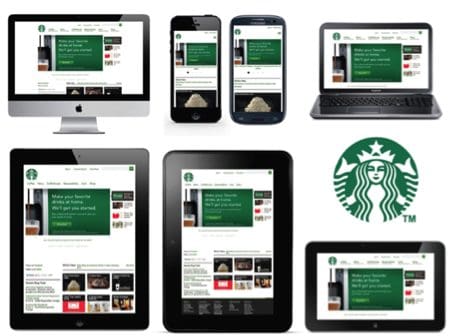
For starters, your readers may have already searched for your brand name (Starbucks or Fiat). Or maybe they typed a request (“best Mexican food in Chicago”) in which case the heavy lifting comes from your SEO and Google.
5. Lose control.
Maybe you already write for ‘responsive design’ sites — those single sites that can morph to accommodate different screens.
The cool thing is they automatically reformat for all sizes and orientations (landscape, portrait, sideways…).
The uncool thing is that you may lose control over where your lines break. If, like me, you’re OCD about line breaks, work with your designer. Find out which heads/subheads can stay intact and which can’t.
6. Stay inside.
Limit outside links. This is the exact opposite of the desktop web strategy, where more outside links = higher page ranking.
The difference here is that on a desktop we’re surfing — happy to break concentration for new information. Tabs and back buttons easily bring us back to where we started.
On mobile we’re hunting. We don’t have the time or bandwidth to poke around. We came to your site for a specific reason.
So limit your mobile links to lead-gens and conversions — just like Anthropologie did here — to keep your readers on the inside.

7. Scroll with it.
You may have noticed that more and more websites are adopting this long scrolling page design. It’s no coincidence that it’s happening just as mobile is taking the lead here.

On a mobile device, it’s way easier to scroll or swipe than to click to an all-new page:
- because of bandwidth issues
- because mobile is inherently designed for swiping, not clicking.
So when creating content for mobile, imagine how the reader is going to interact with your words: swiping, flicking, tapping, spreading and, of course, scrolling.

Related
-

-
| Leilani Yau
How 4 Marketing Pros Designed Their Digital Portfolios
-
| Monica Ortiz
Give Fall Event Planning the Grace of Time
-
-
-
-
| Katherine Gustafson
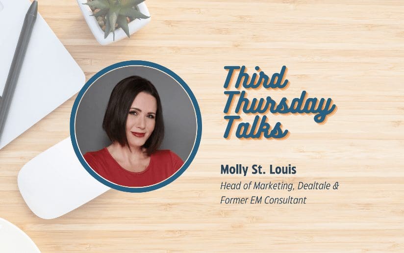
Third Thursday Talks | Molly St. Louis, “3 Types of Content: Earned, Owned, and Branded”
-
-
| Tricia McKinney
9 Project Management Best Practices for Creating Video Content
-
| Barrett Rudich
How to Bring More Value to Your Next Video Project
-
-
| Lynn Bruno
The Curator’s Guide to Shareable B2B Content
-
| Lisa Rodriguez
9 Ways to Move the Needle with Social Media
-
| Annabelle Bayhan
Not Business as Usual: Messaging in the New World
-
| Alexis Keenan
10 Pro Tips for Making Better Quality Video at Home
-
| Molly Tapias
Six Ways to Win at Content Marketing in 2020
-
| Kristen Matthews
8 More Ways to Promote Your B2B Blog
-
-
| Suzy DeLine
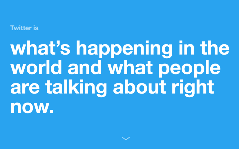
Twitter: What Is It and Should You Do It?
-
| Suzy DeLine
F* It, We’ll Do It Live!
-
| Suzy DeLine
Content Marketing: 2019 Edition
-
-
| Suzy DeLine
Social Media Marketing: Do This, Not That
-
-
-
| Karl Pontau
5 Ways You Can Use Motion Graphics
-
-
| Karl Pontau
Inbound Marketing: How Motion Graphics Improves your ROI
-
| Daniel Gehant
5 Ways Content Marketing Gets Better Engagement
-
-
| Leilani Yau
Story as a Service: Helping Executives Find Their Voices
-
| Leilani Yau
Client Project: Illuminate Education Product Sheets
-
| Suzy DeLine
Message Map: What Is It and Should You Do It?
-
| Suzy DeLine
Lead Nurturing: What Is It and Should You Do It?
-
| Suzy DeLine
Sponsored Content: What Is It and Should You Do It?
-
| Daniel Gehant
SEO for Humans
-
| Suzy DeLine
Content Calendar: Rubber, Meet Road!
-
| Suzy DeLine
Mapping Your Content Possibilities
-
| Suzy DeLine
The Buyer's Journey: Dead or Alive?
-
| Suzy DeLine
Personas: What Are They and Should You Use Them?
-
| Leilani Yau
5 Examples of B2B Facebook Video Marketing
-
-
| Suzy DeLine
Thought Leadership: What Is It and Should You Do It?
-
| Suzy DeLine
Content Marketing: What Is It and Should You Do It?
-
| Alice Chan
Three Ways To Use Content To Promote Your Brand
-
| Whitney Glockner Black
Marketers, Stop Creating Content and Develop a Point of View
-
| Leilani Yau
How to Write a Great Blog Post