The Best Websites: Functionality, Design, Usability
What Is Good Web Design?
As a web designer and developer, I have to consider lots of factors: aesthetically-pleasing color combinations, form and function, screen resolution, image compression, usability, accessibility and website architecture.
How a website looks and feels is very important to customers — it creates a first and lasting impression — so you want to make sure you do this well. As a marketer, you must also consider incorporating features such as e-commerce, an online community, search engine optimization, interactive applications, animations and advertising hosting, but at the same time, make sure your website users don’t get lost or confused.
One way to start the process of figuring out what your website may need is to look at what competitors are doing, as well as other websites who just take the cake in certain aspects such as functionality, design and usability. Here are some of my favorites.
Functionality

MailChimp – To me, this website really falls under all the categories, but I’ll put it under functionality because that is what’s most impressive. Why?
- If you go to the features page and scroll down, you’ll see that the Features Overview menu stays at the top of the page, so you can jump around the content. This is quite elegant.
- Their home page is always going through iterations, which tells me that the probably do a lot of testing, but it always looks great.
- When you sign up, the mailing list tools are fantastic as well. It’s easy to find things, create lists and add subscribers. From the dashboard, you can easily start a new campaign and see how the latest email blast did.
- By the way, MailChimp has great pricing for small companies (like mine). Many companies have to display a pricing comparison page, and theirs is laid out nicely — it’s easy to read and navigate.
Smashing Magazine – They recently redesigned their website, which is good because they were struggling with how to show loads of information. What they ended up with is a dynamic navigation system, reminiscent of MailChimp’s Features menu. As you change the width of your browser, you see several different layouts, and more information as the space becomes available. So clever!
Design

ThinkGeek – This is your typical shopping cart website, but it has an extra treat. Make sure your browser is extended to the edges of your monitor and look at the background. When you scroll to the bottom of the page, you’ll see the background image shift! It’s a clever trick with use of color and CSS. I was so delighted the first time I saw it.
eMusic – This is a very elegant-looking site. I love the black, white and red color palette, as well as the textured backgrounds and etched elements. It really pops and flows together nicely.
Usability
Netflix – Forget about their customer service woes of last year for a moment… I’ve always thought they’ve done a great job with usability. They do a lot of user testing, and it shows. Here’s how:
- When you add a movie to your queue, a dialog box pops up and confirms this and suggests similar movies. They constantly make improvements to the way you browse through movies.
-

Great Website Usability: Netflix’s “Added to Queue” When I click on something, it does what I expect it to do. There’s nothing more frustrating than interacting with a website and having it not do what you expect — or being unable to find what you’re looking for.
- Controlling your movie queue is also done well. Netflix gives the user multiple ways to rearrange things — drag and drop, by rank in the queue, move to the top.

Google Web Fonts – This website just works the way it should. When I’m looking for fonts, I want to collect them, see them with the text I’m going to use and possibly save them for later. It does all of that and more: it also shows you a list of the fonts you’ve collected at the bottom. Once you think you’ve gathered enough, you can review them all side by side.
What are websites you consider well-designed? Please share in the comments!

Related
-
-
| Mackenzie Hamilton
Zero to Launch: Building a Brand in 17 Days with Generative AI
-
| Leilani Yau
How to Build AI into Your Marketing Workflows
-
-
| Kevin Cranfill
The Key to Raising Your Brand Storytelling Game
-
| Monica Ortiz
Give Fall Event Planning the Grace of Time
-
| Leilani Yau
Savvy Storytelling: Meet Luchina Fisher
-
-
| Tricia McKinney
9 Project Management Best Practices for Creating Video Content
-
| Lynn Bruno
How to Make Video Content Production Sustainable
-
| Barrett Rudich
How to Bring More Value to Your Next Video Project
-
| Justin Liszanckie
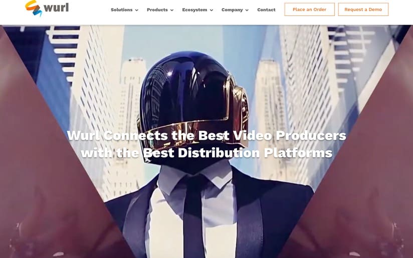
Client Project: Website Redesign for Wurl
-
| Justin Liszanckie
Client Project: Best of Boroughs Ad Campaign Design for Neustar
-
| Karl Pontau
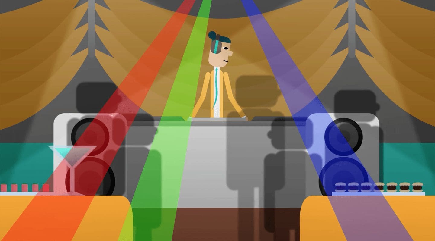
5 Ways You Can Use Motion Graphics
-
-
| Justin Liszanckie
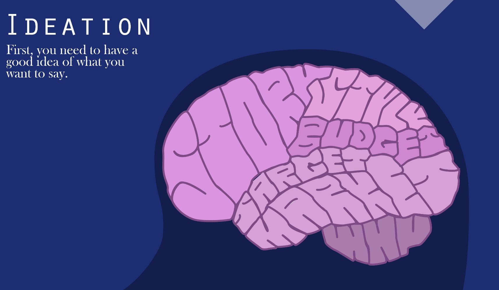
Client Project: Website Redesign for SnapStrat
-
| Karl Pontau
Inbound Marketing: How Motion Graphics Improves your ROI
-
| Justin Liszanckie
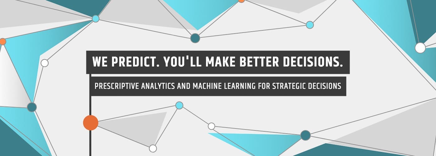
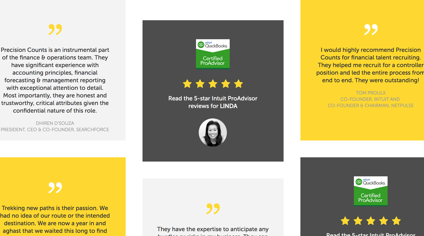
Client Project: Website Redesign for Precision Counts
-
| Justin Liszanckie
Client Project: Design Services for Intuit’s Firm of the Future
-
| Leilani Yau
Client Project: Illuminate Education Product Sheets
-
| Justin Liszanckie
Delightful Design Trends in 2017: Bold Minimalism
-
| Nicole Hanusek
Build Your Website in WordPress
-
| Nicole Hanusek
Why You Should Use Responsive Web Design
-
| Ken Chen
What Makes a Landing Page Effective?